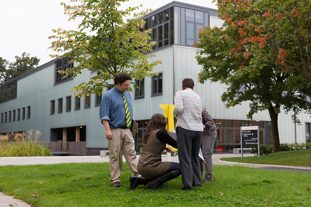
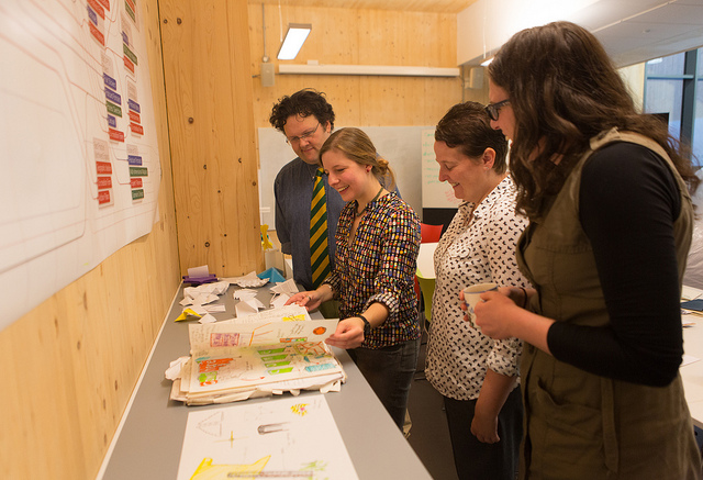
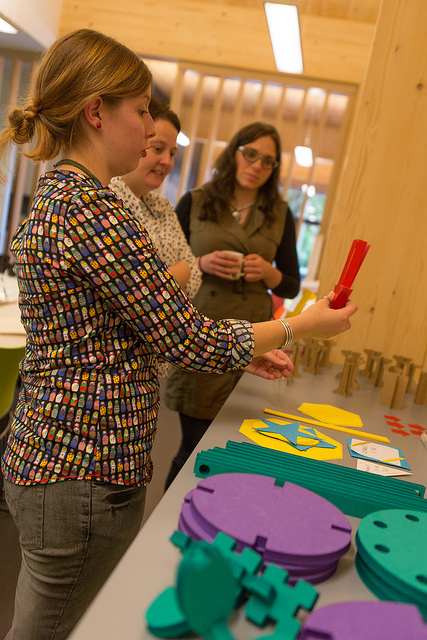
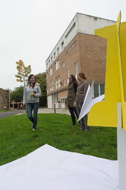
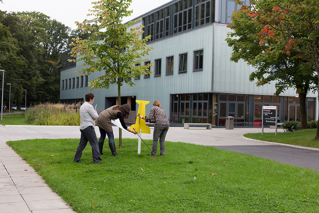
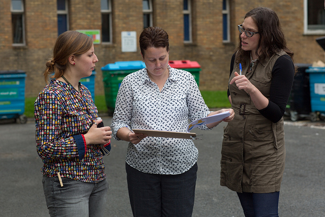
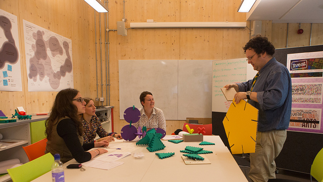
We successfully tested 6 prototypes in total during the session, 3 each for zoners and commenters,. We were delighted at the response to all the designs. Following the tests and discussions, joint decisions were made on which designs to take forward for development and manufacture.
The testing session was highly interactive and inclusive and we have found Helen’s expert knowledge and participation in the design process invaluable. Helen raised many practical issues such as site conditions, the way people might use the tools and how the tools would be stored and transported. This led to more rigorous testing of the proposed tools and Helen’s creative approach gave rise to further ideas for adapting and developing the tools during the next stage.
Zoners
The three options we reviewed for the zoners were:
- Large map pin and compass point
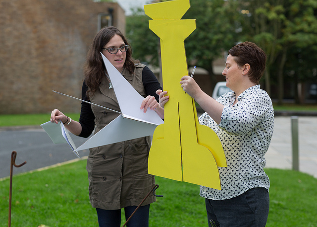
- 3D arrow, tick and X marks the spot
- Mesh arrow
The map pin and compass point stood out as a favourite early on in the session. We discussed the quantity that would be useful to Helen, the best colours to use to ensure the zoners stand out in natural environments and the optimum size – balancing impact and appearance against practical considerations e.g. portability. Material choice will be key to achieving the design criteria and for now we believe that Correx might be a good solution.
A secondary function of the zoners is to allow comments to be collected remotely from the main consultation area, and we tested the idea of writing on a large banner on the ground. However, this proved to be impractical and somewhat inaccessible. One possible alternative is for ideas to be written or drawn on to mini map pins (made from card) which could be stuck in the ground safely using lollipop sticks.
In addition, we will explore a second option, budget allowing, and will look to create a giant arrow structure using permeable mesh banner material and a metal framework.
Commenters
The three options we tested for the commenters were:
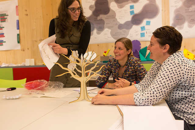
- A “Commentree”
- Interlocking foam (Plastazote) shapes, mainly triangles
- Polypropylene elipses
The team loved the “Commentree”, a plywood tree with commenting cards, but it was decided that too much design and manufacture time was required to refine this option. Perhaps this is one for the future?
In developing the commenter prototypes, we had focused much of our attention refining interlocking teeth around the foam triangles . We had also experimented with ellipses with interlocking slots from polypropylene sheet material which could be flexed to form irregular shapes. . In the test, both proved too complicated to use.
However, surprisingly for us, it was some earlier prototype development tests which caught the team’s attention. They were simple foam ellipses and circles with notches to join together. Once Helen and the team started to play with them, it soon became evident these shapes best fulfilled the brief, satisfying all the design challenges surrounding the commenters and were fun to use. We also explored how smaller ellipses and circles could be used as connectors to add strength, create new paths, connections and junctions, and “full stops”.
We now need to resolve packaging the shapes for storage and transport, and exactly how to attach the comment cards using elastic.
Hayley Alter & Sarah Pickard

